Sunday 10 April 2016
Evaluation Part 8- Looking back to your preliminary task, what do you feel that you have learnt in the progression from it to the full product?
I think that overall it went well and better than expected. When we initially started we worried that we wouldn't complete I or it would be on par with other students work but after a lot of time and effort we feel that we produced something that's of a good standard. The filming process after the first couple of tries went well after we got the hang of it as we all participated in some sort of filming just in case the cinematographer at the time wasn't there. The planning process took a lot of time, as you would expect and we struggled but after we got our ideas and got the view and opinion of the teacher we built on it and got in the swing of things.
The least successful part was the planning and organisation. Even though we did get the hang of planning, we wasted a lot of time which could have gone elsewhere, this being a similar scenario to when we first started filming and didn't know if we should use the Go pro or not. Organisation lacked as we didn't have too much experience and people didn't always show up when they were supposed to or had things they had to do resulting in us at times not having the full group which made organisation and filming worse.
We improved on planning by taking our time and not rushing as well as getting advice from others which helped a lot. With organisation and people not showing we made sure they did otherwise they wouldn't be part of the final product and with organisation we reminded each other of anything we needed when it came to filming so non of us would forget anything which made filming a lot easier.
Evaluation Part 7- What have you learnt about technologies from the process of constructing the product?
Before we started filming we needed to think a lot about what equipment we needed when filming. This including the type of camera what size tripod and if we needed anything like dolly to help with the different type of shots.
The first key decision being what type of camera to use, a regular camera or a Go pro. To test this we began filming the shots involving the investigation wall using both go pro and a standard camera. With the Go pro we both held it as well as used a head cam and found that holding it was better however we struggled with keeping is steady and felt that it didn't look as good compared to having it on your head which was far harder as we couldn't see what the camera was looking at so we decided to use a regular camera for both that shot and the rest of the title sequence.This was made to insure that throughout the title sequence it looked smooth and shots didn't seem out of place because a change of equipment.
The equipment we used was a camera and tripod. Instead of using equipment to tilt and move the camera about we did that by hand and it worked out successfully. The equipment we used all worked out successfully as we didn't want to over do it and over complicate as only Ghanshyam had experience in using any of it so we felt that a camera and tripod would be fine for us.
The least successful thing that came to the equipment was our initial test of the Go pro. We wasted a lot of time using it which we could have spend it other ways and because of this we spent a lot of time shooting the shots involving the investigation wall.
We have learnt to not to test out things for too long as it results in us losing time and to not use equipment for the sake of it, only use things that we actually need.
Evaluation Part 6- How did you attract/address your audience?
The target audience for our title sequence was young adults and late teenagers with the gender we were targeting being male. I think we did well in making a title sequence which appeals the target audience . The style in which we made it is very well done and definitely appeals to a more older and sophisticated audience, not really a child's film.
When planning we felt the sub genre straight away would appeal to males being that action and spy films are watched more by males, we know this through research of similar films and the type of audience that watched them. We also made sure that the style would appeal to males as well as the content of the actual title sequence. This meant including things like guns as well as money which appeals to males more than women. As well as this the typography was researched and changed to a font mores suited for the genre it is not curly like a feminine font, its simple and sleek which is similar to the genre that is 'Spy'.
According to the audience feedback the idea of a time lapse being used was widely appreciated and everyone liked the idea as it was very unique and fitted the title sequence well. As well as this the soundtrack and typography that we changed since the draft was also liked as it fit the genre more and just looked and sounded a lot better.
Least successful was the indoor shot. The teacher felt that it could be re done, which we did but it didn't go to well. As well as this improve the time lapse by slowing it down so you are able to see Agent x as people were unable to see him. the time lapse part we were able to fix so Agent x is much more noticeable.
The indoor scene could have been improved by taking mores shots as well as bringing in more things. We could have brought some notes as well as experimented in the way we shot as it seemed amateurish compared to the rest of the title sequence
Evaluation Part 1- Brief
The brief for the course work was to make roughly a 2-minute title sequence of a genre of our choice, as well as this it must conform to the genre. As a group we decided to make a title sequence for a film we called ‘Agent x’. A spy film about a man who is on the run as he is framed and set up by a double agent. The sequence starts by introducing the two main characters, Michael Caine’s character and Agent x. It then goes onto show iconic British landmarks as this is where the film is set. It goes on to start to show the antagonist, Morgan freeman’s character and it starts to give the audience a feel on the type of people these characters are going to be in the film. The films initial genre is action with a sub-genre of spy. We chose spy because we felt that it would be good to do being that we live near London and London is iconic in spy films. As well as this we all enjoy spy films so we felt that we would be able to give the sub-genre of spy some justice being that we have seen a lot of spy films.
Final Title Sequence
This is the final title sequence. A lot has changed since the draft as we listened to teachers advice as well as looked at the feedback sheets. We have introduced a variety of different shots as well as changed the editing, soundtrack and typography to something much better. As well as this we have introduced the first couple of shots from the opening scene.
Production Log
This is the Production log we sued to keep track on when and where we will be filming. In then end we didn't rely on this as we already new the dates and what we needed as well we constantly reminded each other when we will next be filming through our group chat.


Journal Entry 13- Finalise Editing
Today was the final time we were able to edit to and put all of the shots together. The groups two editors were bale to do this very quick and show the teacher to get any last advice for the shots. This included advice on how to sort out the indoor shots so we decided to add a filter as well as darken the final title sequence shot and slow it down.
As well as this Ghanshyam made a really good title so we implemented instead of just having the title floating in the air.

As well as this Ghanshyam made a really good title so we implemented instead of just having the title floating in the air.

Journal Entry 12- Refilming Desk Shots
Today three of the group decided to re shoot the desk scene after the teacher feeling that we cold include more stuff and just make the shot better as well as darker.
The shooting didn't go well after the cinematographer at the time wasn't unable to keep the camera still resulting in a lot of movement. As a result we decided to scrap the sots and just keep the originals and play around with the contrast and darkness of the shots.
The shooting didn't go well after the cinematographer at the time wasn't unable to keep the camera still resulting in a lot of movement. As a result we decided to scrap the sots and just keep the originals and play around with the contrast and darkness of the shots.
Journal Entry 11- Bexleyheath
Today we went to Bexleyheath to film the opening shots of the chase scene. We were going to originally film it all while we where at London but before we could finish we were told to leave being that it was a no filming zone. This resulted in us having to use both the London clip we filed as the opener as the characters run down the stairs we will use the Asda garage at Bexleyheath.
In the end we got all of the shots after a couple of re shots. We took a while to think about how the chase scene would go considering its not the full shot just the opening shots. As well as this we needed to think about the camera angles as we didn't have the storyboard to follow.
In the end we got all of the shots after a couple of re shots. We took a while to think about how the chase scene would go considering its not the full shot just the opening shots. As well as this we needed to think about the camera angles as we didn't have the storyboard to follow.
Saturday 9 April 2016
Journal Entry 10- London
Today we went back up to London to re film the shots as well as add some more. We changed up shots as we felt the originals were not so good.
One shot we changed was the briefcase exchange. instead of the two characters walking into the middle of the screen in front of the MI6 building we did it completely different. We firstly had me play Michael Caine's
character which makes more sense. I go over to a bench were Agent x is and set the briefcase up next to me while avoiding eye contact, Agent x then goes onto take and walk. While doing this the background is filled with buildings including The MI6 building. I think the shot looks much better especially with the dark area where me and James are and the light that comes from the background.
We also decided to change up the way in which we shot the British iconography as well as including more shots. Ghanshyam experimented that we he filmed including looking up a building which looked very good.
One thing the teachers said is to make the time lapse more clear so we change location and slowed it down so you are able to see Agent x passing by.
Overall we got a lot of good shots and we are confident that we can improve the title sequence.

Journal Entry 9- Re- Filming London Shots
After the teachers advice as well as looking back on the title sequence we have decided to go back to London and re film. As well as this we were also told to make our title sequence longer by including first couple shots of the opening scene so we are going to also go Bexleyheath to film a chase scene.
To make sure that the shots are not wonky we are going to use a tripod which isn't broken so the shot don't look tilted as well as bring extra batteries just in case we run out
To make sure that the shots are not wonky we are going to use a tripod which isn't broken so the shot don't look tilted as well as bring extra batteries just in case we run out
Journal Entry 8- Response To Feedback
After looking over the shots and reading all of the feedback sheets we have decided to re film the briefcase exchange shot as well as the shots showing the houses of parliament. We are going back to London next week Sunday as we have all agreed on the date. The equipment we are going to bring are the camera and tripod. We have learnt from our previous mistakes and are bring in a tripod that isn't broken, unlike the one we used on the other shots.
As well as this we realised that Ghanshyam places both Michael Caine and Morgan Freemans character so instead of playing Michael Caine's character I will.
As well as this we realised that Ghanshyam places both Michael Caine and Morgan Freemans character so instead of playing Michael Caine's character I will.
Feedback Sheet's

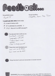


These are the feedback sheets we were given by the rest of the groups and teachers based on the showing of the first draft.
We received mostly positive feedback about the setting and time lapse being a good idea. The most common negatives being the fact that some of the shots were to shaky which we already new once re watching the shots so we have already begun re filming the shaky shots.
The other advice we where is that the shot inside doesn't have enough items, especially for someone who is supposed to be hiding out. We have re filmed this scene however it didn't turn out well so we have decided to leave and instead Sinead recommend to put a filter on it to make it less simplistic.
Journal Entry 7- Editing
We have know got all of the footage so our two editors, Ghanshyam and James can now begin editing while me and Adam give advice and our opinions on what they are doing. We have decided to do a very simplistic edit with just cut sand transitions with text appearing on the screen and then slowly disappearing. We have also decided to speed up on clip and turn it into a time lapse which we all agreed and think its a really good idea and very unique.
Typography

Friday 8 April 2016
Journal Entry 6- Filming
Me, Ghanshyam and James went up to London to begin shooting. We filmed nearby the MI6 building to show Michael Caine's character giving Agent x a briefcase full of useful items. After filming right next to the MI6 building we decided to film further across the river so you can only see the building in the background. The two actors (James and Ghanshyam) struggled to exchange briefcases without James having to bend down to pick up. After shooting we realised that i will play have to play Michael Caine as Ghanshyam plays both Morgan freeman character swell as Michael Caine which doesn't make sense. We also found it difficult to get both characters to meet in the middle of the screen at the same time.
After multiple time of filming the shot we then moved onto filming some London iconography, this included the houses of parliament as well as well as shot that goes over the Thames showing a variety of different building including the London eye in the background. When it came to filming the houses of parliament we struggled with the shot without the camera shaking.
We then began the time lapse shot which firstly shows agent x walk across the screen and then goes onto show the public behind to show time passing. The time lapse turnt out well except for the tripod being broken resulting in the shot being titled.
Journal Entry 5- Deciding To FIlm
As a group we have decided to go up London and film on Monday 16th February. We are going to film in locations such as Vauxhall bridge, houses of parliament and the London eye area. We are going to bring the camera we have booked out as well as the steady cam, Go Pro and tripod.
We have looked at the weather and soon that it is dry and sunny which is good for the type of shots we want. We have decided to meet at Berwick gate at 10am as this way we can get the most of the daylight as all of our shots need to be shot in the daylight.
Journal Entry 4- Repsonse to Pitch
The response to the pitch was very positive. Both teachers and students noticed the amount of effort put into the pitch. Adam was mostly in control being that he done both film and media last year and said he had a lot of experience in making pitches.
Pitch
My group has made a successful pitch on our spy film Agent X. The pitch features information on the plot, as well as sub plot. Including this we have also picked the actors that would play the different roles in the film. We have Morgan Freeman, Michael Caine, Daisy Ridley and Josh Bowman. In our pitch we used a budget of £50 million after discussion and advice we have changed it to around the £100 million mark. Are target audience is males around the age of 16-40, roughly. The occupation includes anything from students to the people who are earning a lot of money, the second to top social class.
The pitch itself went alright. We didn't have the greatest of planning so we just jumped in to different parts so there wasn't an awkward pause in the middle of the pitch.
The pitch itself went alright. We didn't have the greatest of planning so we just jumped in to different parts so there wasn't an awkward pause in the middle of the pitch.
Audience Profile

This the audience profile we have made for our film. The people will feel who will watch our film we teenagers as well as adults. Spy films are always seen as being classy as well as having a lot of action, which applies to Agent X.
The film will mostly target the male genre being that most males like spy and action films with the secondary audience being older men as well as females.
The psychographics of the film are a variety of people, those who go to see an action film and just enjoy and also those who go to appreciate the film. This film is both for those who go and see the film on their own and in social gatherings, to be enjoyed with a group of friends or family.
The film will be targeted to the heterosexual males as that is what the man audience of action and pay films tends to be.
The income will range from students who have no and those who work on saturdays to adults who working seven days a week and earning £18 thousand a year plus.
Journal Entry 3 - Test Shots
On the 5th February me, Ghanysham and James started to do some test shots using the go pro to film the show which involves the wall filled with evidence which Morgan Freeman character uses to try and find Agent X. We experimented with a variety of equipment including using the go pro hand held as well as putting the go pro on our heads.
The test filming went unsuccessfully as we struggled to hold the camera steadily, when we thought we held the camera steadily and viewed the footage on a computer we noticed it was still shaking. With the go pro on someone's head it wasn't shaking but it was very difficult to get it in line with images.
The test filming went unsuccessfully as we struggled to hold the camera steadily, when we thought we held the camera steadily and viewed the footage on a computer we noticed it was still shaking. With the go pro on someone's head it wasn't shaking but it was very difficult to get it in line with images.
Journal Entry 2- Newspapers
After making the investigation wall we also needed to make a newspaper which will be used as a prop. the front cover will consist of a news article about Agent x and him being wanted in connection with a murder. Because Ghanshyam does art we felt that he would be the best candidate to make the newspaper and we felt that the final product was very good.


Journal Entry 1- Investigation Wall
While discussing ideas on what to include in our title sequence James came up with idea of including and investigation wall that Morgan Freemans character can use which complied up with different images to do with Agent x. He go this idea from Daredevil and we all agreed that its a very good idea so we begin to find images and anything relevant and use a wall in our media class to put it up on.
This is what the final product looks like and overall I think it looks really good and is conventional to the spy genre.

This is what the final product looks like and overall I think it looks really good and is conventional to the spy genre.

Storyboard
This is the story board our group has made. We feel that the final title sequence will have changed a lot compared to this but this is a good starting point and good way to see our ideas in a picture format.


Mission Impossible Rogue Nation
http://www.artofthetitle.com/title/mission-impossible-rogue-nation/#
The Mission Impossible Rogue Nation title sequence is your typical title sequence for a spy and action film. from the typical spy song to the choices of imagery.
The song used is your typical spy song which is very fact paced and goes well with the fast paced nature of the title sequence. Where the song builds up there is quicker cuts and more images coming onto the screen. Because of the fast paced nature the title sequence itself is also very short compared to Spectre's 3 minute plus.
The imagery is very conventional showing a lot of high etch gadget's as well as weapons and money. The theme being that something is set on light and burning in the background as everything is coming onto the screen.
The sequence is very conventional in that its fast paced showing off everything you would expect from and exciting, action packed spy film. Even down to the bold font choice used when showing off the actors names.
I like this style of title sequence because of how fast paced and short it is. Its very exciting and keeps me involved in watching compared to other much longer title sequences which can get boring resulting in me skipping over them.
Goldfinger
http://www.artofthetitle.com/title/goldfinger/
Goldfinger, similar to Spectre goes for the variety of images as well as the classy old fashioned song, being that Goldfinger was made in 1964 I feel the song is appropriate the time and a lot more common when it comes to title sequence.
The title sequence involves clips that are shown on a gold panted woman. For the time eh editing is very good, nothing compared to Spectre however. It is very stylish and once again uses flames which seem to be a common theme when it comes to Bond's title sequences. A black background is used to show good contrast when it comes to the golden women being in the frame.
The overall feel is very conventional with a lot of mystery such as number plates and people running about. As well as this there is a lot of scenes which feature cars and people who are well dressed which I a common theme when it comes to spy films.
I personally don't like this title sequence when compared to the newer James Bond because doesn't look as refined. However if I saw this title sequence in the 60's then I would think this looks amazing and would grab my attention.
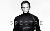
James Bond Spectre
http://www.artofthetitle.com/title/spectre/
The James bond spectre title sequence, a lot like other recent James bond films is very polished and classy, from the song used in the background to the overall flow of the title sequence as well as the editing.
The song used is Sam Smiths "Writing's on the Wall" Its very lf fashioned sounding song, not an upbeat song like a lot of the stuff in the charts. It fits with the old fashioned spy that is James Bond.
The title sequence's imagery includes weapons and women as well as bond himself being tangled up by and octopus. The colours are very bright in scenes with flames appearing into the background to glass shattering showing previous bond villain's and characters. The editing used to incorporate the imagery is very technical and professional.
The title sequence is conventional to the spy genre in showing all o these we come to expect in a spy film as well as the classy soundtrack. In some parts where the octopus is used to shows a more darker side, which is common in more recent bond films however this isn't necessarily conventional to the spy genre.
In my opinion I like the title sequence and feel that a lot of effort has been put into and its something that I would watch instead of doing something else while waiting for the film to start
Wednesday 6 April 2016
Spy Analysis
The genre 'Spy' is considered to be a sub genre of action. or thriller. More recent or upcoming spy films include Kingsman: The Secret Service, Bridge of Spies, The Man from U.N.C.L.E. Spy films are usually set in England and revolves around some sort of government group that are very secretive and have missions involving either killing a target or preventing some sort of data from being taken such as military plans.
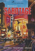
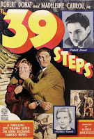
Spy films being set in Britain's secret service and the army has been used as setting point for spy films since the 1920s. The spy genre was made much more popular because of Alfred Hitchcock's influence in the 1930s with films such as 'The Man Who Knew Too Much, The 39 Steps and Sabotage.
The style of films spy come across as are usually very sleek with a mostly simplistic plot. Films such as James bond usually have a fairly simple plot but what makes viewers captivated is that characters as well as action and scenery, Another key part being the soundtrack with James bonds soundtrack often winning awards.
The cinematography a lot like action films change a lot. During action sequences then there will often be a lot of long an extremes closes ups with quick cuts. During talking scenes there will often be mid shots and close ups of the character faces.
The mise en scene will most often follow the same or similar theme as previous spy films. Props will include guns as well as some sort of technology as well as car, in James bond this is often a luxury, iconic British car such as an Aston Martin or Jaguar. The setting is also usually in Britain, London and through out the film the spy will explore other countries showing iconic land marks. The costume for the spy is very smart as they will wear a suit or tuxedo. For the women its usually a dress or revealing clothing as the women are sexualised, especially in the modern James Bond films. This is also shown with the make up as the women are also wearing bright red lipstick.


Spy films being set in Britain's secret service and the army has been used as setting point for spy films since the 1920s. The spy genre was made much more popular because of Alfred Hitchcock's influence in the 1930s with films such as 'The Man Who Knew Too Much, The 39 Steps and Sabotage.


The style of films spy come across as are usually very sleek with a mostly simplistic plot. Films such as James bond usually have a fairly simple plot but what makes viewers captivated is that characters as well as action and scenery, Another key part being the soundtrack with James bonds soundtrack often winning awards.
The cinematography a lot like action films change a lot. During action sequences then there will often be a lot of long an extremes closes ups with quick cuts. During talking scenes there will often be mid shots and close ups of the character faces.
The mise en scene will most often follow the same or similar theme as previous spy films. Props will include guns as well as some sort of technology as well as car, in James bond this is often a luxury, iconic British car such as an Aston Martin or Jaguar. The setting is also usually in Britain, London and through out the film the spy will explore other countries showing iconic land marks. The costume for the spy is very smart as they will wear a suit or tuxedo. For the women its usually a dress or revealing clothing as the women are sexualised, especially in the modern James Bond films. This is also shown with the make up as the women are also wearing bright red lipstick.

The Genre
As a group we have decided to pick the genre or sub genre of spy. This is because we all like spy films such as James Bond and the Bourne franchise. We have also decided to do spy as the main focus point of spy films is British intelligence, being that we live in London we thought filming round the MI6 building would be a perfect spot for our spy film.


Tuesday 8 March 2016
Location Shots
These are the shots that were took to give us an idea of the location sand what the shots look like on the camera. The shots are also done when its bright and daylight as that is the type of weather that we want for our title sequence.


Soundtrack Options
Soundtrack Options
Soundtrack 1
Soundtrack 2
Soundtrack 3
https://audionetwork.lgfl.org.uk/production-music/all-to-play-for_28071.asp
As a group we have decided to pick soundtrack 3 as the music to use in our title sequence. We have listened to all three careful and feel that soundtrack 3 most suits the pacing and style of our title sequence. The song initially starts of slow paced as we begin to show British iconogrpahy and then it picks up as we begin to show close ups of different objects to the character and spy genre such as guns and passports.
Friday 22 January 2016
Continuity Sequence
For a first attempt at filming with the group i think that it came out okay. There were a few issues involving filming such as lighting and few cases were we filmed a good scene but because it was blurry we were unable to use it. In my edit i used mostly old shots because i preferred the dark colours as it sets the scene more. The edit itself is poor. I spent very little time on it so a few of the shots are rushed and there is background noise in others.
Overall, i have learnt to take more time when filming and remember we won't get the perfect shot in one take. Also take in account how long editing is so not to rush it and spend time with it as it can make or break a piece of film.
Wednesday 20 January 2016
Lord of War
Lord of War is a 2005 crime war film directed by Andrew Niccol. The film follows Nicolas Cage who plays and illegal arms dealer. The story is inspired by real life arms dealers and smugglers.
The sequence sets the audience into the eyes of a bullet and its journey all the way up to its use in the end. The shots consist of a lot of POV shots as the bullet goes across a variety of different terrains. The colours change drastically from the dull blue and grey in the construction to more bright colours when its used in Africa. This already shows the theme which heavily surrounds war and gun culture in Africa and how guns can travel from the first world countries to the third well countries.
The typography used has a strong military theme. It has a silver colouring and is very bold and blocky. The positioning of the typography differs. Sometimes it is placed in the centre but other times either the left or right. The typography is also made in a way so the names of the people are bold whereas what ever they in the film isn't for example "written and directed by" is in a smaller font whereas "Andrew Niccol" is more bold and bigger.
The song used in the opening sequence is called "For What It's Worth" by Buffalo Springfield. The song itself has a country/rock sound and sounds quite happy, which cant be said about what's going in the background which is showing people getting ready for war by dealing weapons and ammunition. This is good use of contrapuntal sound as the music doesn't go with what's going on at all. I think this is done to show how numb people are to war and the happy music shows that the arms dealers don't really care that these weapons will be used in some sort of war and used to kill people, including civilians.
Tuesday 19 January 2016
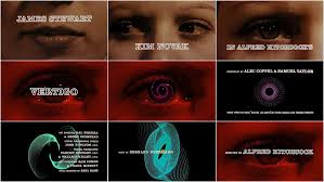
Vertigo
Vertigo is a 1958 psychological thriller film directed by Alfred Hitchcock. The film stars a former police detective who was forced into early retirement after an incident which caused him to develop a fear of heights as well as vertigo.
The music used in the title sequence is mysterious with the low note in sync with the text coming onto the screen. The text itself is white with just the outline, not white filled into the letters, like a stencil. The text moves onto the screen at the begging of the title sequence into the centre.
It initially starts with just a woman's face as the camera goes across. She seems scared as shown when it goes onto just her eyes and they are moving about frantically. The camera moves across her face slowly, this seems the whole pace of the title sequence, very slow pace and almost disturbing just having the face of a scared woman.
The title is designed by Saul Bass which follows Saul Bass graphic style which is very modern for this time.
Once the title of the film has appeared on the screen as spiral pattern forms out of the woman's eye. The pattern changes colours and shapes and more people in the film appear on the screen on the right side of the screen, no longer the centre.
In my opinion, taking into consideration the time it was made, I like the title sequence. I like the way in which the camera moves over the girls face showing her emotions as the min actos in the ilm flash up onto the screen, as well as the unusual pattern which changes colour.
Vertigo Title Sequence: http://www.artofthetitle.com/title/vertigo/
Friday 15 January 2016
OCR Specification For Media AS
Video
Preliminary exercise: Continuity task involving filming and editing a character opening a door, crossing a room and sitting down in a chair opposite another character, with whom she/he then exchanges a couple of lines of dialogue. This task should demonstrate match on action, shot/reverse shot and the 180-degree rule.
Main task: the titles and opening of a new fiction film, to last a maximum of two minutes.
All video and audio material must be original, produced by the candidate(s), with the exception of music or audio effects from a copyright-free source. Both preliminary and main tasks may be done individually or as a group. Maximum four members to a group.
The Incredible Hulk
The Incredible Hulk is a 2008 American superhero film based of marvel comic character the Hulk. The film shows the backstory of how Bruce Banner becomes Hulk through a military scheme to create a super soldier.
The opening sequence shows the science and experiments behind Bruce Banners change into the Hulk. It shows when he changes and all of the damage he causes once he becomes Hulk. It also shows a lot of military blue prints and new paper cuttings, a lot like the Se7en title sequence.
The typography is placed in the centre of the shot and moves toward the camera. The colour is a bright green, the same colour as Hulk. The font is very generic and simple, I think this is done as they want the audience to be concentrating on the imagery, not typography. The text also overlays the imagery, not like Se7en where it was after the images on a black background.
The visuals of the title sequence seems uses blurred imagery while showing Hulks devastation as if to show the audience how Bruce Banner is while hulk, right and wrong is blurred and he has no self control. It also shows in some parts a slight green tint when showing the imagery, green being the colour of hulk.
In a discussion with Kyle cooper, the person who made the title sequence he said that his primary goal was to tell the origin story in a prologue, rather than spending time on the expository during the film. I think that he has succeeded this in telling it in a simplistic way instead of incorporating the backstory into the film which could make the film 30 minutes longer.
I like the way in which its made and the way it shows how Bruce became hulk. Also it is made well with edits that fit the mood and the film in general, green typography, blurred lens when he is hulk.
Hulk Title Sequence: http://www.artofthetitle.com/title/the-incredible-hulk/
Se7en
Se7en is a 1995 crime film about two detectives who investigate a serial killer who kills people that he feels represents one of the seven deadly sins. The title designer is Kyle Cooper who also worked on American Horror Story and The Walking Dead.
The title sequence throughout feels very dark and disturbing. A lot of disturbing imagery used including someone peeling of there skin with a blade and someone crossing the face of a young boy off with a marker. Dark colours are used through with a dark song that isn't pleasant to listen to. the text used is very scruffy and handwritten. The text is placed on a black background and flashes onto the screen and shakes while on the screen.
The sequence itself has been seen to have similarities to Stephen Frankfurt's title design of To Kill a Mockingbird, which similarly to Se7en features a lot of close up photography of items that relate to an important character in the film.
Being that I haven't seen the film I feel the title sequence relates to this serial killer. The scraping of the skin shows the mental state that this serial killer is in and the crossing out of children faces could either be the people that he has killed or him as a child. It could show him saying that the boy is dead and that he's a new person now.
I like the intro and can see the similarities to it in more recent projects such as American Horror Story. The intro is very unique and off putting which reflects the way in which the killer would most likely make you feel if you were in that situation. I also like the art style and flashing imagery and fast paced cuts which makes it not drag, unlike how I feel about a lot of title sequences.
Se7en Title Sequence: http://www.artofthetitle.com/title/se7en/
American Horror Story Title Sequence: http://www.artofthetitle.com/title/american-horror-story/
To Kill A Mockingbird Title Sequence: http://www.artofthetitle.com/title/to-kill-a-mockingbird/
Wednesday 13 January 2016
The Art Of Film Title Design Throughout Cinema History
The first few lines of the paragraph named " The (True) Birth Of The Title Sequence" starts with, "Breakthrough ideas in titling, such as timing the typography to interact with metaphorical imagery or to create its own world, were largely innovations that came from outsiders to the Hollywood studio system." This going against the idea that all great ideas, films, actors and anyone part making a film comes out of Hollywood as Hollywood has always been seen as being the heart of cinema. The examples used being people such as Saul Bass and Pablo Ferro.
Saul Bass is known for work on the title sequence of films such as Goodfellas, vertigo and Psycho where we worked with Pablo Ferro. Bass was known for using a new type of "kinetic typography" which he used in Vertigo and Psycho.

Pablo Ferro has been working with moving image for over 40 years. This includes Stanley Kubrick's Dr Strangelove. He has received the Chrysler Design Award, the Art Director Club Hall of Fame Award and the AIGA Medal.
 Another point in the article that I find interesting is that "The imagery behind the credits received a lot more attention. I feel that this is true to an extent, especially now. Nowadays, the opening sequence seems to show a lot more imagery and not care as much about the way the text appears on the screen and the style, this not saying that they don't care about the typography just not as much as the older tile sequences where it almost depended on the typography. An example being The Girl With the Dragon Tattoo directed by David Fincher. The intro is heavily focused on what is going on in the background, not the text coming up with the actors names.
The next point is "in one of his interviews, Kyle Cooper states that while the power of computer graphics is obvious, he still likes experimenting with live action, because there is something special about the imperfection of making things by hand." I agree with this statement. It feels more gratifying in making something without the aid of computer programs as you have more freedom in being able to do what you want and actually doing, not some computer program helping you and as a result your work may not be perfect but something perfect in the sense of making an opening sequence would be boring.
"Waltograph was created by Justin Callaghan in an attempt to capture the spirit of the familiar Walt Disney signage". The font itself looks very much like Walt Disney. I find this interesting as it shows how much of an influence these big companies have on people. People are making things in tribute. Justin Callaghan also has a variety of fonts seen in Walt Disney movies and place son the website MickeyAvenue.com
The final point I will talk about is also the final point in the article. "As designers have always known, the opening moments can make a deeply satisfying contribution to any film". As someone who often watches both films and television series the opening sequence puts you into the mood of the film and should give you a rough idea on the feel of the film. If I am not really feeling the begging then I wont necessarily stick through the whole film. First impressions are everything as you may not always get a second chance.
Saul Bass is known for work on the title sequence of films such as Goodfellas, vertigo and Psycho where we worked with Pablo Ferro. Bass was known for using a new type of "kinetic typography" which he used in Vertigo and Psycho.

Pablo Ferro has been working with moving image for over 40 years. This includes Stanley Kubrick's Dr Strangelove. He has received the Chrysler Design Award, the Art Director Club Hall of Fame Award and the AIGA Medal.

The next point is "in one of his interviews, Kyle Cooper states that while the power of computer graphics is obvious, he still likes experimenting with live action, because there is something special about the imperfection of making things by hand." I agree with this statement. It feels more gratifying in making something without the aid of computer programs as you have more freedom in being able to do what you want and actually doing, not some computer program helping you and as a result your work may not be perfect but something perfect in the sense of making an opening sequence would be boring.
"Waltograph was created by Justin Callaghan in an attempt to capture the spirit of the familiar Walt Disney signage". The font itself looks very much like Walt Disney. I find this interesting as it shows how much of an influence these big companies have on people. People are making things in tribute. Justin Callaghan also has a variety of fonts seen in Walt Disney movies and place son the website MickeyAvenue.com

The final point I will talk about is also the final point in the article. "As designers have always known, the opening moments can make a deeply satisfying contribution to any film". As someone who often watches both films and television series the opening sequence puts you into the mood of the film and should give you a rough idea on the feel of the film. If I am not really feeling the begging then I wont necessarily stick through the whole film. First impressions are everything as you may not always get a second chance.
Subscribe to:
Posts (Atom)