Friday 22 January 2016
Continuity Sequence
For a first attempt at filming with the group i think that it came out okay. There were a few issues involving filming such as lighting and few cases were we filmed a good scene but because it was blurry we were unable to use it. In my edit i used mostly old shots because i preferred the dark colours as it sets the scene more. The edit itself is poor. I spent very little time on it so a few of the shots are rushed and there is background noise in others.
Overall, i have learnt to take more time when filming and remember we won't get the perfect shot in one take. Also take in account how long editing is so not to rush it and spend time with it as it can make or break a piece of film.
Wednesday 20 January 2016
Lord of War
Lord of War is a 2005 crime war film directed by Andrew Niccol. The film follows Nicolas Cage who plays and illegal arms dealer. The story is inspired by real life arms dealers and smugglers.
The sequence sets the audience into the eyes of a bullet and its journey all the way up to its use in the end. The shots consist of a lot of POV shots as the bullet goes across a variety of different terrains. The colours change drastically from the dull blue and grey in the construction to more bright colours when its used in Africa. This already shows the theme which heavily surrounds war and gun culture in Africa and how guns can travel from the first world countries to the third well countries.
The typography used has a strong military theme. It has a silver colouring and is very bold and blocky. The positioning of the typography differs. Sometimes it is placed in the centre but other times either the left or right. The typography is also made in a way so the names of the people are bold whereas what ever they in the film isn't for example "written and directed by" is in a smaller font whereas "Andrew Niccol" is more bold and bigger.
The song used in the opening sequence is called "For What It's Worth" by Buffalo Springfield. The song itself has a country/rock sound and sounds quite happy, which cant be said about what's going in the background which is showing people getting ready for war by dealing weapons and ammunition. This is good use of contrapuntal sound as the music doesn't go with what's going on at all. I think this is done to show how numb people are to war and the happy music shows that the arms dealers don't really care that these weapons will be used in some sort of war and used to kill people, including civilians.
Tuesday 19 January 2016
Vertigo
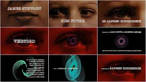
Vertigo is a 1958 psychological thriller film directed by Alfred Hitchcock. The film stars a former police detective who was forced into early retirement after an incident which caused him to develop a fear of heights as well as vertigo.
The music used in the title sequence is mysterious with the low note in sync with the text coming onto the screen. The text itself is white with just the outline, not white filled into the letters, like a stencil. The text moves onto the screen at the begging of the title sequence into the centre.
It initially starts with just a woman's face as the camera goes across. She seems scared as shown when it goes onto just her eyes and they are moving about frantically. The camera moves across her face slowly, this seems the whole pace of the title sequence, very slow pace and almost disturbing just having the face of a scared woman.
The title is designed by Saul Bass which follows Saul Bass graphic style which is very modern for this time.
Once the title of the film has appeared on the screen as spiral pattern forms out of the woman's eye. The pattern changes colours and shapes and more people in the film appear on the screen on the right side of the screen, no longer the centre.
In my opinion, taking into consideration the time it was made, I like the title sequence. I like the way in which the camera moves over the girls face showing her emotions as the min actos in the ilm flash up onto the screen, as well as the unusual pattern which changes colour.
Vertigo Title Sequence: http://www.artofthetitle.com/title/vertigo/
Friday 15 January 2016
OCR Specification For Media AS
Video
Preliminary exercise: Continuity task involving filming and editing a character opening a door, crossing a room and sitting down in a chair opposite another character, with whom she/he then exchanges a couple of lines of dialogue. This task should demonstrate match on action, shot/reverse shot and the 180-degree rule.
Main task: the titles and opening of a new fiction film, to last a maximum of two minutes.
All video and audio material must be original, produced by the candidate(s), with the exception of music or audio effects from a copyright-free source. Both preliminary and main tasks may be done individually or as a group. Maximum four members to a group.
The Incredible Hulk
The Incredible Hulk is a 2008 American superhero film based of marvel comic character the Hulk. The film shows the backstory of how Bruce Banner becomes Hulk through a military scheme to create a super soldier.
The opening sequence shows the science and experiments behind Bruce Banners change into the Hulk. It shows when he changes and all of the damage he causes once he becomes Hulk. It also shows a lot of military blue prints and new paper cuttings, a lot like the Se7en title sequence.
The typography is placed in the centre of the shot and moves toward the camera. The colour is a bright green, the same colour as Hulk. The font is very generic and simple, I think this is done as they want the audience to be concentrating on the imagery, not typography. The text also overlays the imagery, not like Se7en where it was after the images on a black background.
The visuals of the title sequence seems uses blurred imagery while showing Hulks devastation as if to show the audience how Bruce Banner is while hulk, right and wrong is blurred and he has no self control. It also shows in some parts a slight green tint when showing the imagery, green being the colour of hulk.
In a discussion with Kyle cooper, the person who made the title sequence he said that his primary goal was to tell the origin story in a prologue, rather than spending time on the expository during the film. I think that he has succeeded this in telling it in a simplistic way instead of incorporating the backstory into the film which could make the film 30 minutes longer.
I like the way in which its made and the way it shows how Bruce became hulk. Also it is made well with edits that fit the mood and the film in general, green typography, blurred lens when he is hulk.
Hulk Title Sequence: http://www.artofthetitle.com/title/the-incredible-hulk/
Se7en
Se7en is a 1995 crime film about two detectives who investigate a serial killer who kills people that he feels represents one of the seven deadly sins. The title designer is Kyle Cooper who also worked on American Horror Story and The Walking Dead.
The title sequence throughout feels very dark and disturbing. A lot of disturbing imagery used including someone peeling of there skin with a blade and someone crossing the face of a young boy off with a marker. Dark colours are used through with a dark song that isn't pleasant to listen to. the text used is very scruffy and handwritten. The text is placed on a black background and flashes onto the screen and shakes while on the screen.
The sequence itself has been seen to have similarities to Stephen Frankfurt's title design of To Kill a Mockingbird, which similarly to Se7en features a lot of close up photography of items that relate to an important character in the film.
Being that I haven't seen the film I feel the title sequence relates to this serial killer. The scraping of the skin shows the mental state that this serial killer is in and the crossing out of children faces could either be the people that he has killed or him as a child. It could show him saying that the boy is dead and that he's a new person now.
I like the intro and can see the similarities to it in more recent projects such as American Horror Story. The intro is very unique and off putting which reflects the way in which the killer would most likely make you feel if you were in that situation. I also like the art style and flashing imagery and fast paced cuts which makes it not drag, unlike how I feel about a lot of title sequences.
Se7en Title Sequence: http://www.artofthetitle.com/title/se7en/
American Horror Story Title Sequence: http://www.artofthetitle.com/title/american-horror-story/
To Kill A Mockingbird Title Sequence: http://www.artofthetitle.com/title/to-kill-a-mockingbird/
Wednesday 13 January 2016
The Art Of Film Title Design Throughout Cinema History
The first few lines of the paragraph named " The (True) Birth Of The Title Sequence" starts with, "Breakthrough ideas in titling, such as timing the typography to interact with metaphorical imagery or to create its own world, were largely innovations that came from outsiders to the Hollywood studio system." This going against the idea that all great ideas, films, actors and anyone part making a film comes out of Hollywood as Hollywood has always been seen as being the heart of cinema. The examples used being people such as Saul Bass and Pablo Ferro.
Saul Bass is known for work on the title sequence of films such as Goodfellas, vertigo and Psycho where we worked with Pablo Ferro. Bass was known for using a new type of "kinetic typography" which he used in Vertigo and Psycho.

Pablo Ferro has been working with moving image for over 40 years. This includes Stanley Kubrick's Dr Strangelove. He has received the Chrysler Design Award, the Art Director Club Hall of Fame Award and the AIGA Medal.
 Another point in the article that I find interesting is that "The imagery behind the credits received a lot more attention. I feel that this is true to an extent, especially now. Nowadays, the opening sequence seems to show a lot more imagery and not care as much about the way the text appears on the screen and the style, this not saying that they don't care about the typography just not as much as the older tile sequences where it almost depended on the typography. An example being The Girl With the Dragon Tattoo directed by David Fincher. The intro is heavily focused on what is going on in the background, not the text coming up with the actors names.
The next point is "in one of his interviews, Kyle Cooper states that while the power of computer graphics is obvious, he still likes experimenting with live action, because there is something special about the imperfection of making things by hand." I agree with this statement. It feels more gratifying in making something without the aid of computer programs as you have more freedom in being able to do what you want and actually doing, not some computer program helping you and as a result your work may not be perfect but something perfect in the sense of making an opening sequence would be boring.
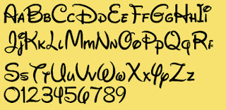
"Waltograph was created by Justin Callaghan in an attempt to capture the spirit of the familiar Walt Disney signage". The font itself looks very much like Walt Disney. I find this interesting as it shows how much of an influence these big companies have on people. People are making things in tribute. Justin Callaghan also has a variety of fonts seen in Walt Disney movies and place son the website MickeyAvenue.com
The final point I will talk about is also the final point in the article. "As designers have always known, the opening moments can make a deeply satisfying contribution to any film". As someone who often watches both films and television series the opening sequence puts you into the mood of the film and should give you a rough idea on the feel of the film. If I am not really feeling the begging then I wont necessarily stick through the whole film. First impressions are everything as you may not always get a second chance.
Saul Bass is known for work on the title sequence of films such as Goodfellas, vertigo and Psycho where we worked with Pablo Ferro. Bass was known for using a new type of "kinetic typography" which he used in Vertigo and Psycho.

Pablo Ferro has been working with moving image for over 40 years. This includes Stanley Kubrick's Dr Strangelove. He has received the Chrysler Design Award, the Art Director Club Hall of Fame Award and the AIGA Medal.

The next point is "in one of his interviews, Kyle Cooper states that while the power of computer graphics is obvious, he still likes experimenting with live action, because there is something special about the imperfection of making things by hand." I agree with this statement. It feels more gratifying in making something without the aid of computer programs as you have more freedom in being able to do what you want and actually doing, not some computer program helping you and as a result your work may not be perfect but something perfect in the sense of making an opening sequence would be boring.
"Waltograph was created by Justin Callaghan in an attempt to capture the spirit of the familiar Walt Disney signage". The font itself looks very much like Walt Disney. I find this interesting as it shows how much of an influence these big companies have on people. People are making things in tribute. Justin Callaghan also has a variety of fonts seen in Walt Disney movies and place son the website MickeyAvenue.com

The final point I will talk about is also the final point in the article. "As designers have always known, the opening moments can make a deeply satisfying contribution to any film". As someone who often watches both films and television series the opening sequence puts you into the mood of the film and should give you a rough idea on the feel of the film. If I am not really feeling the begging then I wont necessarily stick through the whole film. First impressions are everything as you may not always get a second chance.
Subscribe to:
Posts (Atom)